
How an elephant can help a brand grow
A strong product alone isn’t enough. You need clarity: sharp choices in go-to-market strategy, positioning and brand identity.
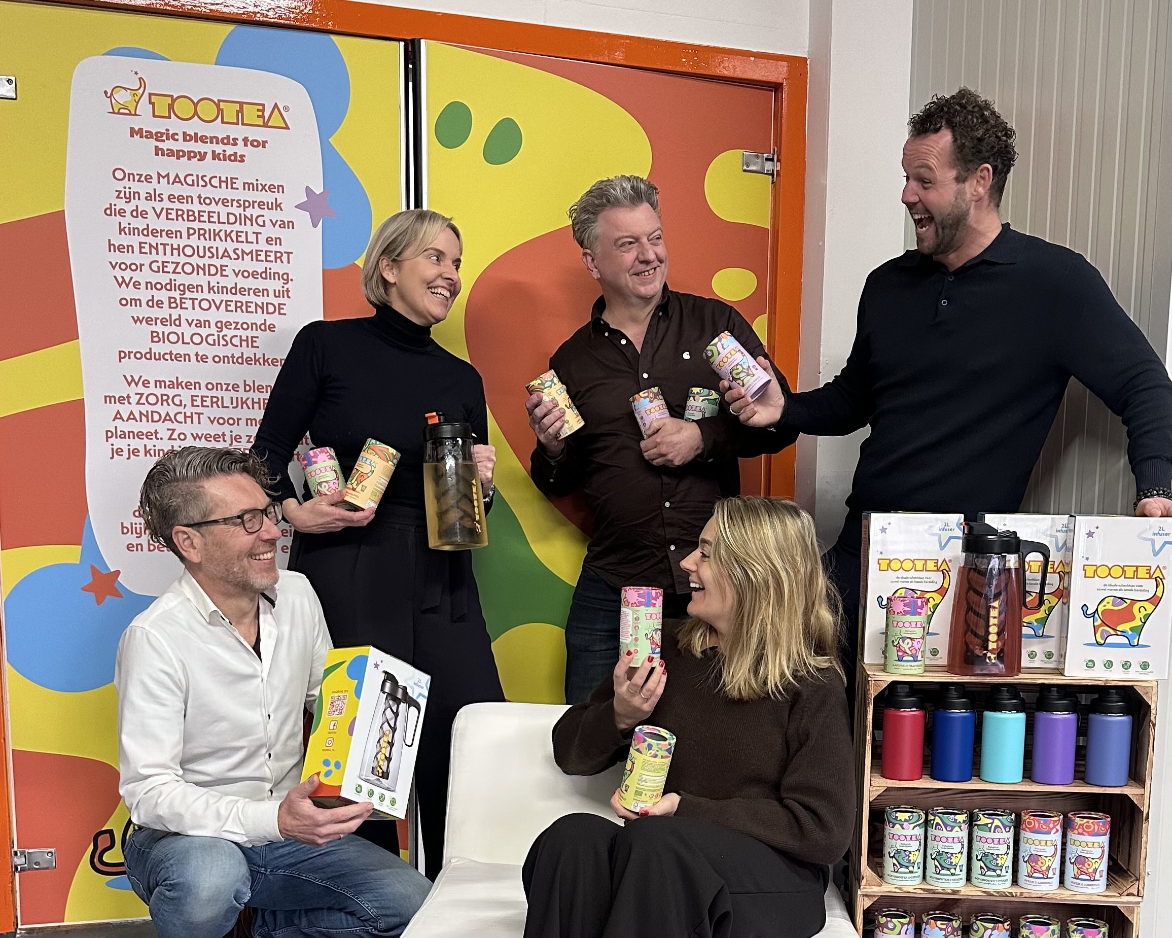
TooTea is a young, ambitious company with a clear mission: to help build a healthier, sugar-free generation. Its magical blend of fruit, herbs and flowers teaches young children what flavour is and learn them enjoy taste without sugar.
As startup you need to be different, but to grow beyond that, you need a distinctive brand with brand assets that are recognisable and memorable. This is especially if you want to grow by expanding from a B2B approach to B2C.
That’s how we help drive the next stage of growth for an impact brand like TooTea: a startup with a strong product portfolio and real entrepreneurial drive, but where the next phase calls for a rethink to be ready to shine on the shelves.
In 2025, TooTea’s founders, Joey Blom and Jurian de Wilde, teamed up with us at Perspective for a complete rethink of their brand and communication.
This project was about more than just a packaging redesign. We sharpened the proposition, a new brand identity created distinctive brand assets, new packaging and a toolbox for communication programs. An identity that speaks to Gen Z; the young mothers and caretakers at the day care and after school centres.
We started with a brand strategy workshop with the founders, where we sharpened the positioning. Next, we evaluated the brand assets present. From there, you choose. Define a limited number of elements to build on and amplify. Make them unique for the brand.
At Perspective, the research of Byron Sharp and Jenni Romaniuk plays an important role in how we think. Characters are among the strongest brand assets when it comes to recognition.
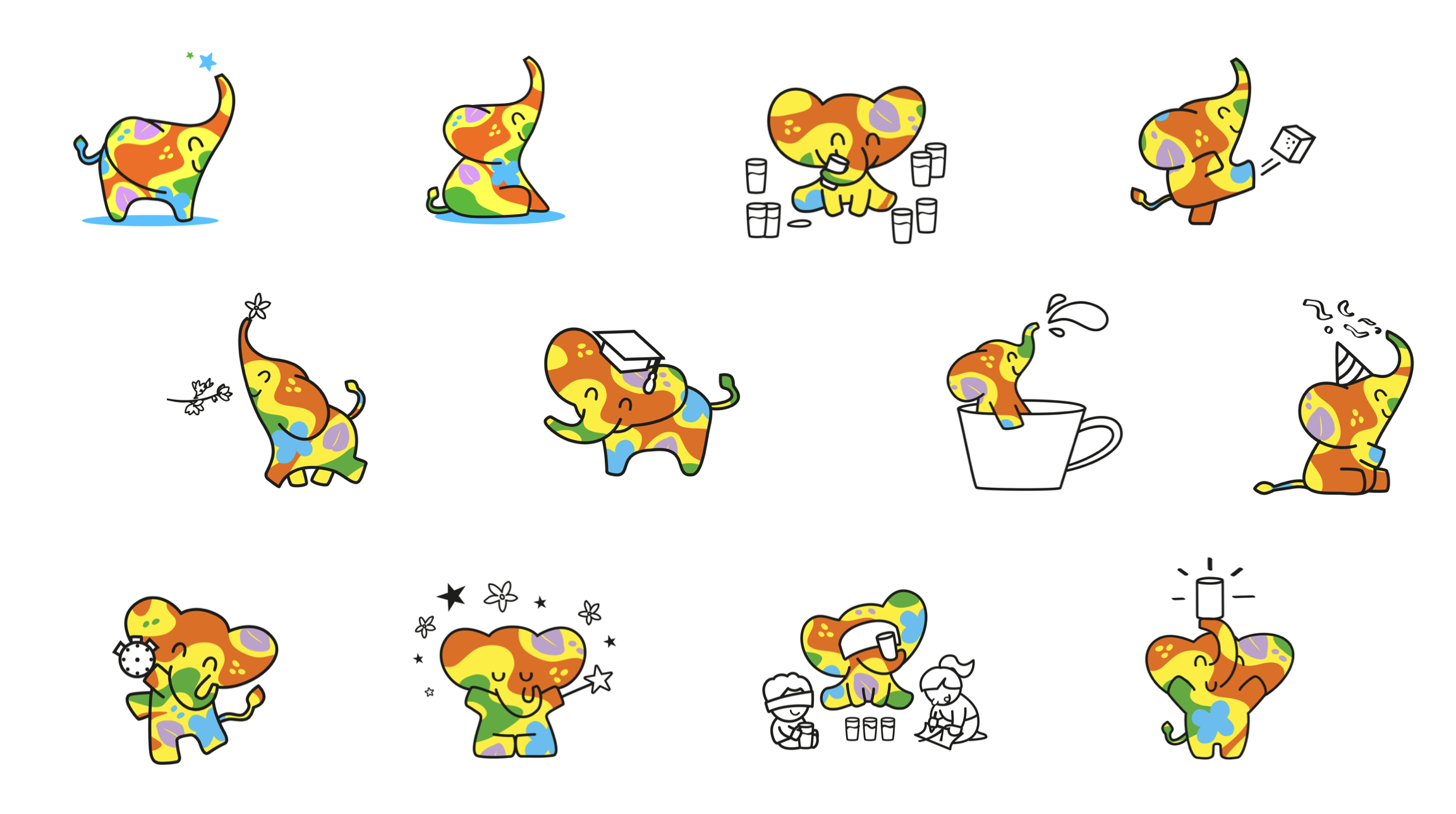
The ‘colourful elephant’ is the spokesperon for the sharpened messaging to daycare centres, parents and retail as basis for sustainable growth.
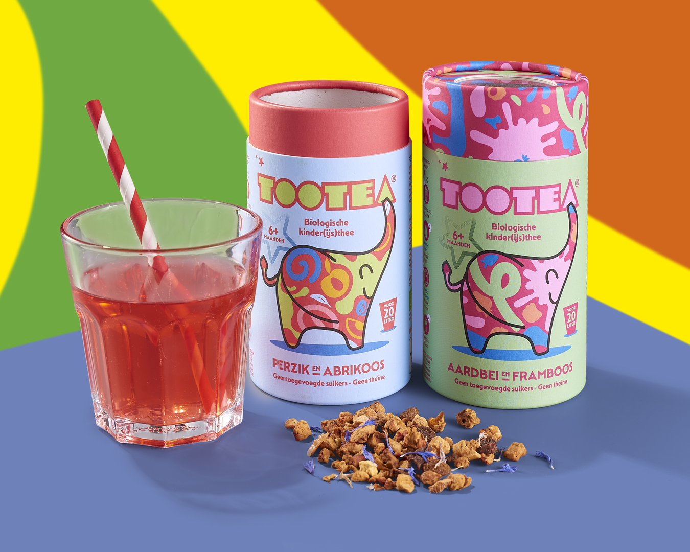
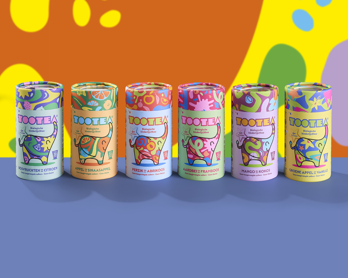
For TooTea, we developed a dynamic identity around the elephant. It’s a character that can be brought to life on many levels. Not just to segment the flavour range, but also on all level of communications. In this way it helps build memory structures while leaving room for variation.
Children are the users, but not the decision-makers. That’s why the packaging was designed for Gen Z and young millennials, who make the choices for children as parents or professionals.
The look and feel still had to make clear that this is a product for children. We chose a style that is mindful, joyful and a little bit enchanting, one that translates the ‘magic blends’ of herbs, flowers and fruit into colour and shape.

- Privacy
- Cookies
- Cookie settings
- © 2026 Perspective Brussels BV