
Lead with the beet
Belgium’s most iconic sugar brand was losing relevance. Over time, fragmented packaging designs had weakened its presence on shelf and loosened its connection with consumers.
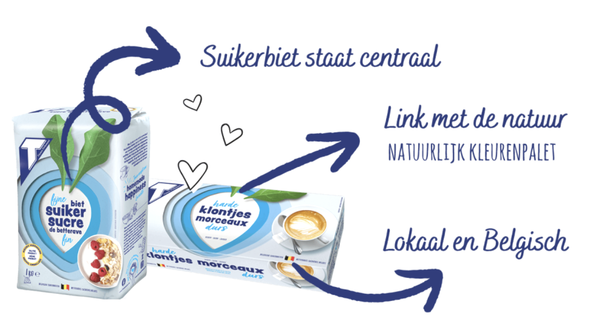
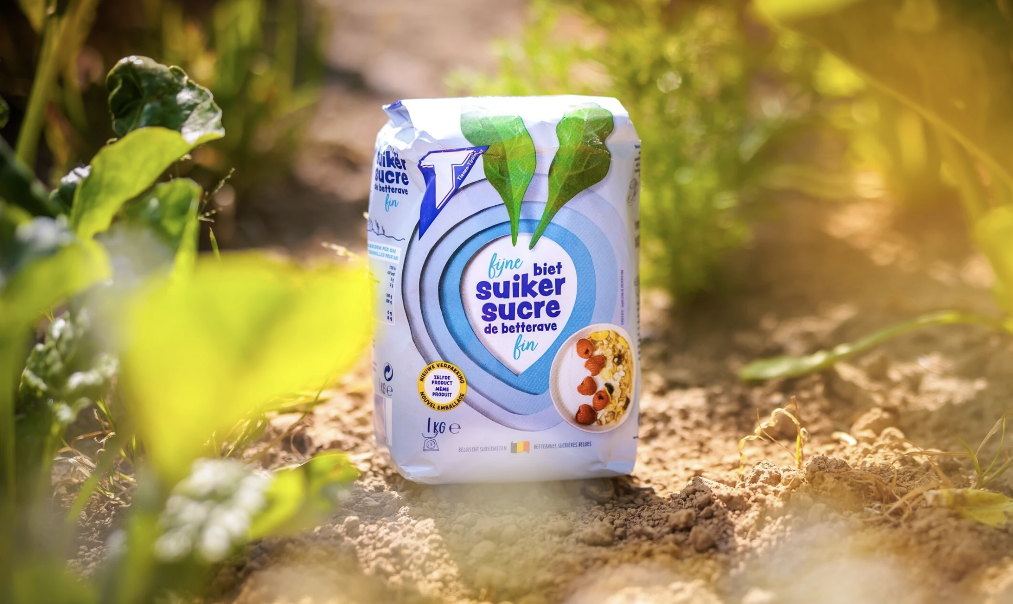
Tiense Suiker starts in Belgian soil, with the sugar beet, its natural origin. It’s the brand’s most authentic story, yet it has never been the focus of the packaging. We saw more than a raw material. We saw a shape that could tell the brand’s story at a glance. By putting it front and centre, the simple, distinctive shape became the key visual element across the range.
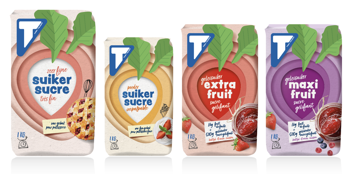
So lead with the beet. Its silhouette became the signature of the visual identity, a distinctive asset that brings the entire range together under a single brand architecture and roots every pack in authenticity.
The result: renewed consumer trust, stronger shelf impact, and a memorable story that secures Tiense’s place as Belgium’s enduring sugar brand.
Since 2001, Nike has been partnering with Tiense Suikerraffinaderij (Südzucker Group) working across multiple brands. Later, Nike and Marcel worked together on both local and international projects. Part of this work was created at their previous agency SGK. Today, the collaboration continues with Perspective.

- Privacy
- Cookies
- Cookie settings
- © 2026 Perspective Brussels BV