
Making true taste of the past relevant for today
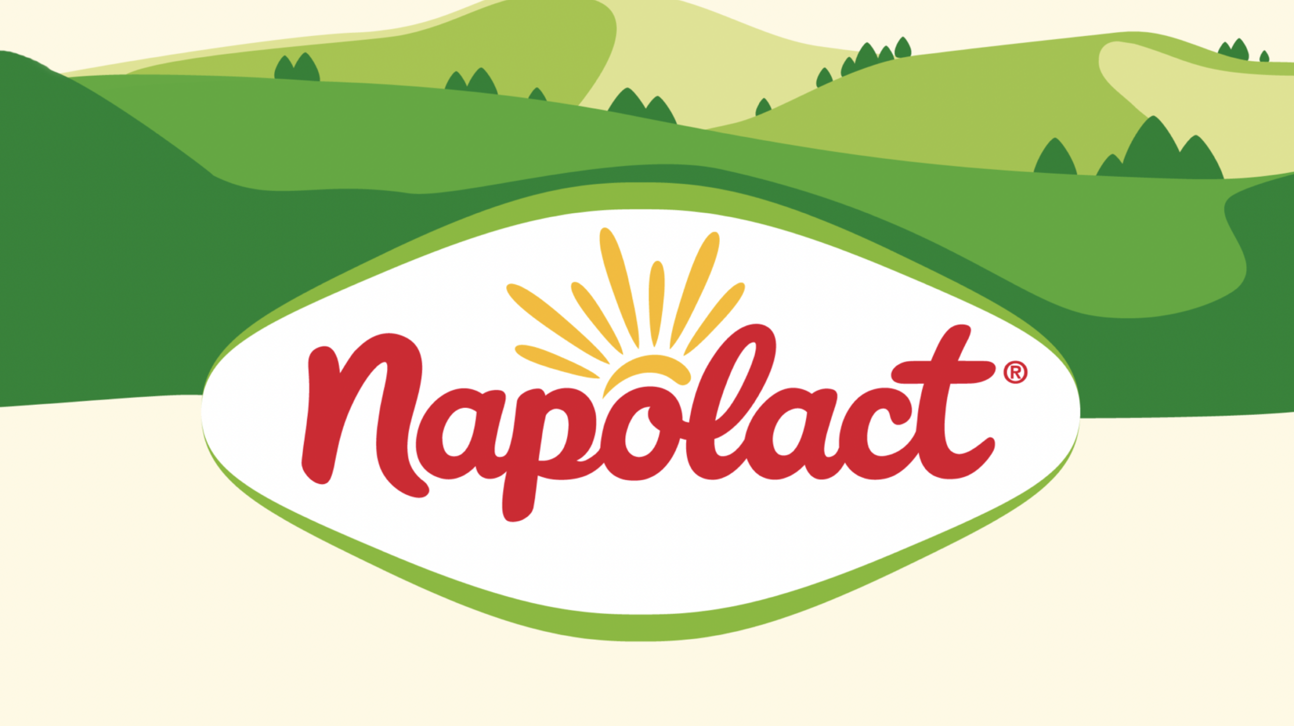
Napolact is perhaps the most famous dairy brand in Romania, with a strong heritage linked to the Transylvanian mountains, specifically the Ardeal.
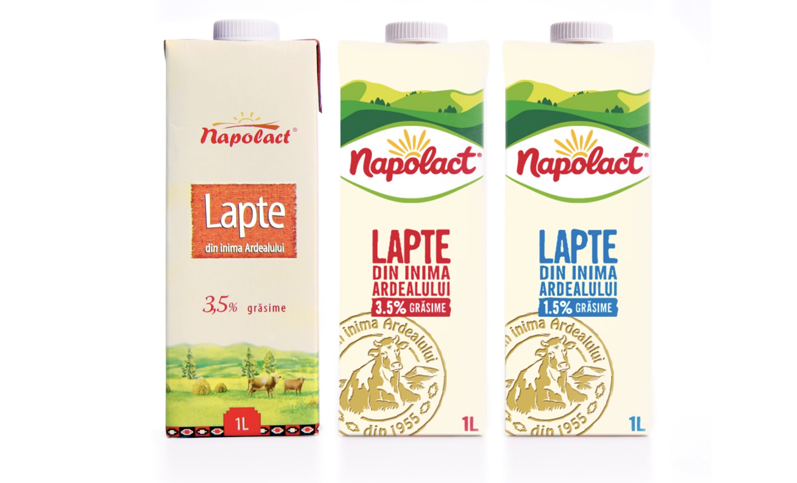
This heritage on its own was also the problem. It lacked relevance for todays consumers. Its brand & packaging design was not able to compete in the modern day supermarket environment.
This multidisciplinary project is the most successful reposiioning project within the FrieslandCampina organisation.
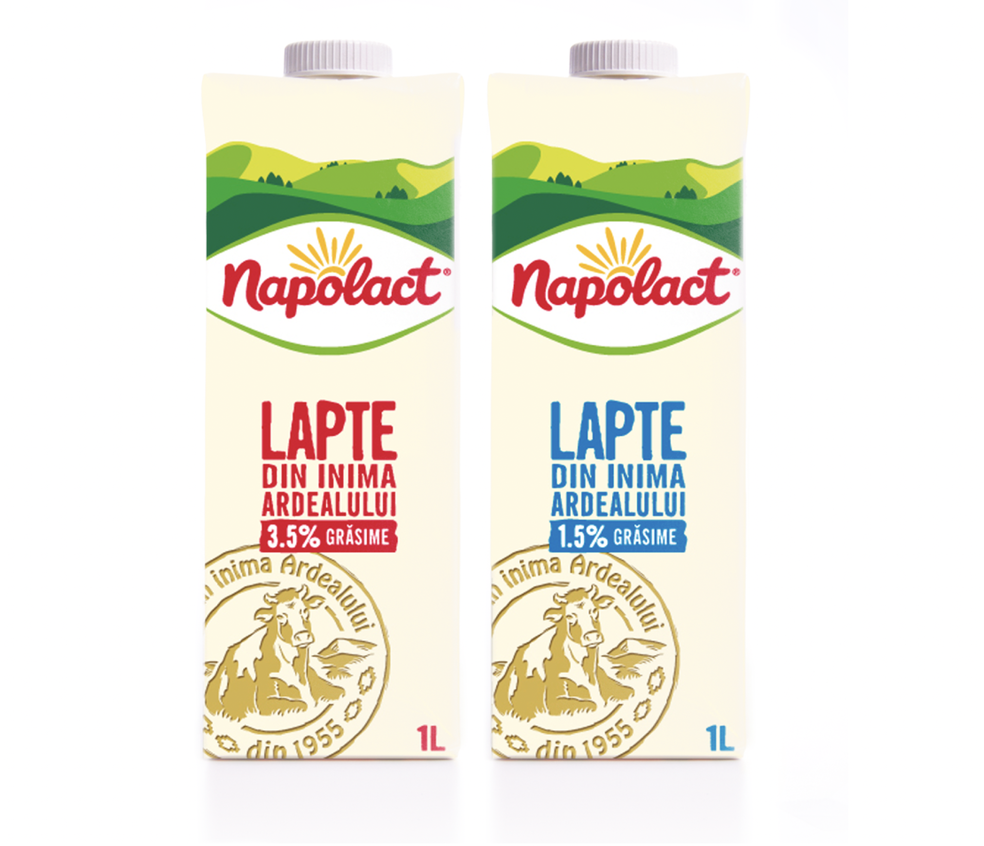
Napolact is a brand of FrieslandCampina’s portfolio in Romania. A brand with a long history and considered the best dairy even in the communist area. Dairy with a strong origin and provenance, but losing market share to newer brands.
Positioning, brand identity and communication was all very regressive and linked to how grandparents would eat and use dairy. It simply didn’t connect to modern Romanian consumers.
After evaluation of the old brand identity the only asset we could build on was the creamy colour. Brand archtecture and visual style all needed to be redefined and designed from scratch.
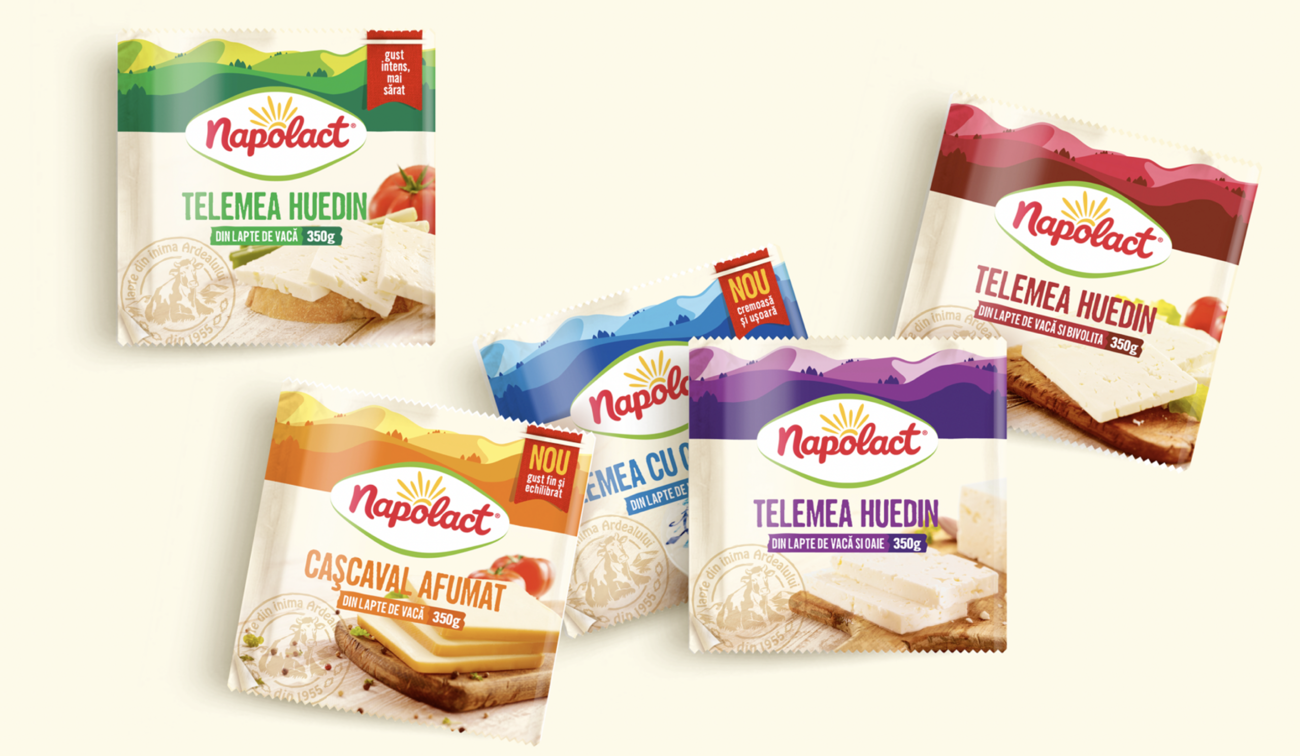
A new brand logo connected to the mountains of Ardeal as proud flagbearer for a portfolio of about 80 SKU’s across several departments in the supermarket. A flexible brand system to balance the need for segmentation and shelfimpact in all these segments. A ‘classic’ stamp to emphasize the provenance on a new brand & packaging design for todays and tomorrow’s consumers.
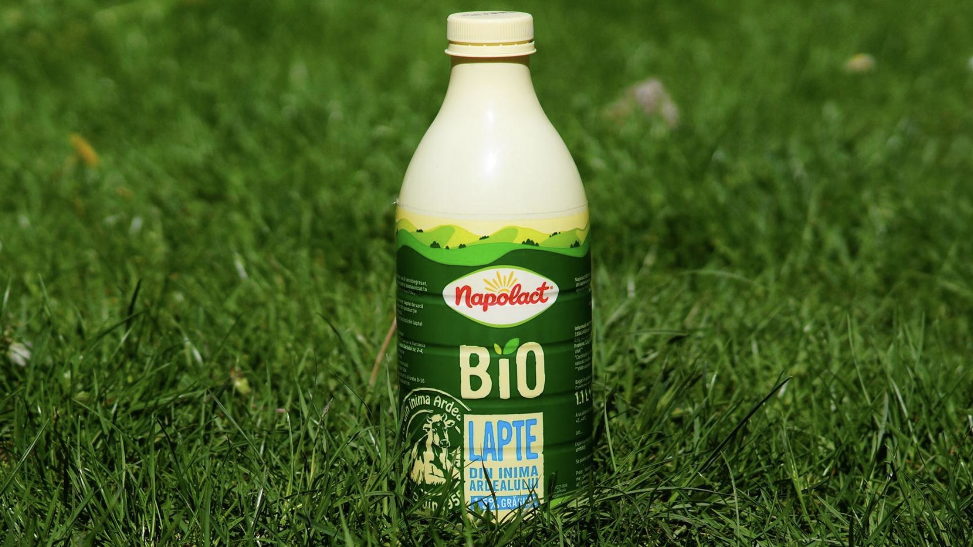
The project was vital for the future of FrieslandCampina in Romania. A senior local team led by Jan Willem Kivits (GM) and Razvan Orbalescu (marketing director) was set up in cooperation with an innovation team from HQ in the Netherlands. David Taylor for brand positioning and communication platform, At VBAT Theo and Rob Deurenberg worked in several workshop settings towards a groundbreaking redesign of Napolact. Building on the heritage, the creamy colour as strongest brand asset and developing new assets like the logo and a portfolio across several market segments in traditional supermarkets and the growing OOH market.
The alignment and clarity in the process made this to the most successful repositioning in the FrieslandCampina organisation and grew the brand back to its former strength in Romania.

- Privacy
- Cookies
- Cookie settings
- © 2026 Perspective Brussels BV