
Brand assets that last
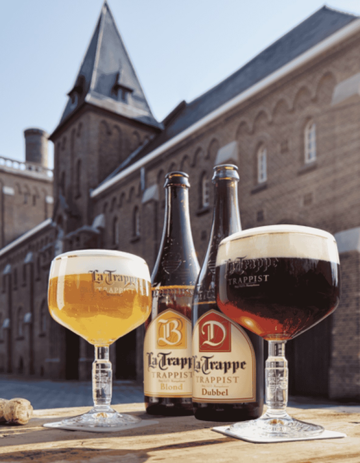
The current design of La Trappe is unchanged since 2000 and the best proof strong brand assets can help grow a century old Trappist monastery to grow into an international beer brand.
The Authentic Trappist Product label shape is assigned by the International Trappist Association (ITA) to just ten breweries that meet their strict criteria. The shape of the label can only be used by those few Trappist breweries. The old brand did not have any assets worth taking into consideration for the redesign.
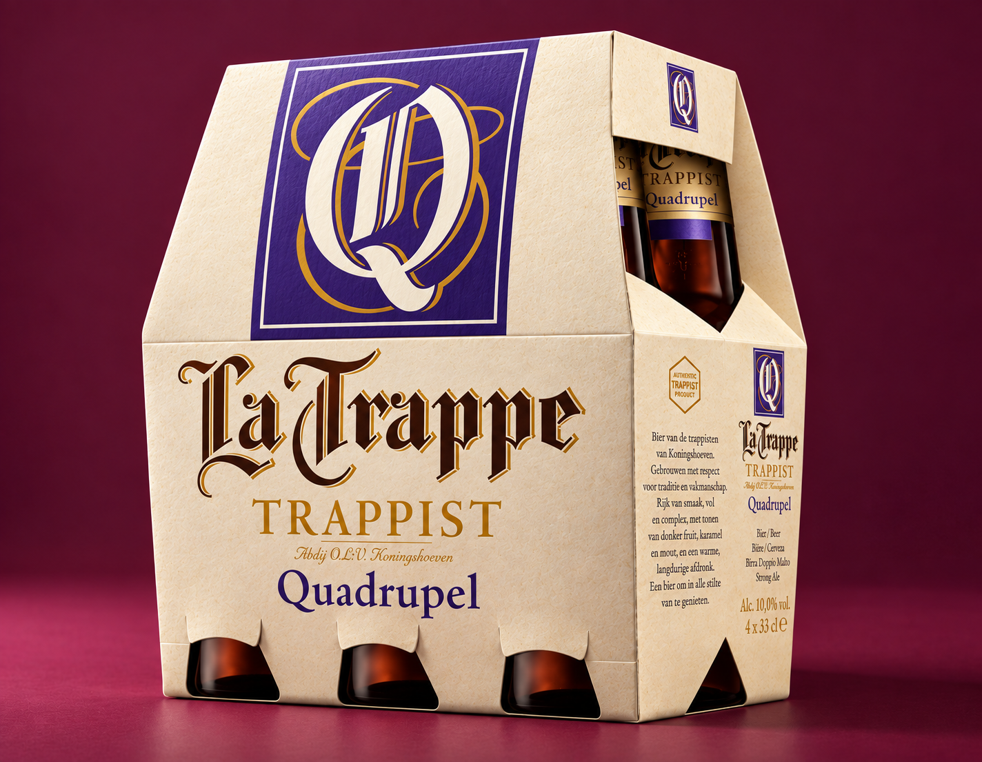
The breakthrough idea was linking the brand to the old breviary books handwritten by the monks. The idea is using the illustrated capitals as icon for the product portfolio, a more prominent use of the brand typeface and a dominant colour range to create shelf impact.

Consumers hope to experience the flavours of decades ago. Beers craft-fully brewed according to secret recipes. Untouched magic. Therefor a true trappist brewery as La Trappe should convey these images of true trappist beers.
A brand identity where the Abbot of the monastery stated with a big sigh of relief that finally stillness has come back to the brand. Hence unchanged for 25 years. Designed by Marcel & partners at BrandNew. New products designed by XXX

- Privacy
- Cookies
- Cookie settings
- © 2026 Perspective Brussels BV