
Finding balance for international food brands
Unilever is a company with an international food portfolio, aiming for strong alignment of brand identity, architecture and packaging design across markets. For many countries this uniform appearance is very successful. But sometimes this brand uniformity is simply rejected by consumers, threatening the strong position some brands have in individual countries.
They are all established brands that derive their strength by distinctiveness. Finding a balance to local positioning and international brand guidelines means taking a step back and making them both work.
Cup-a-Soup
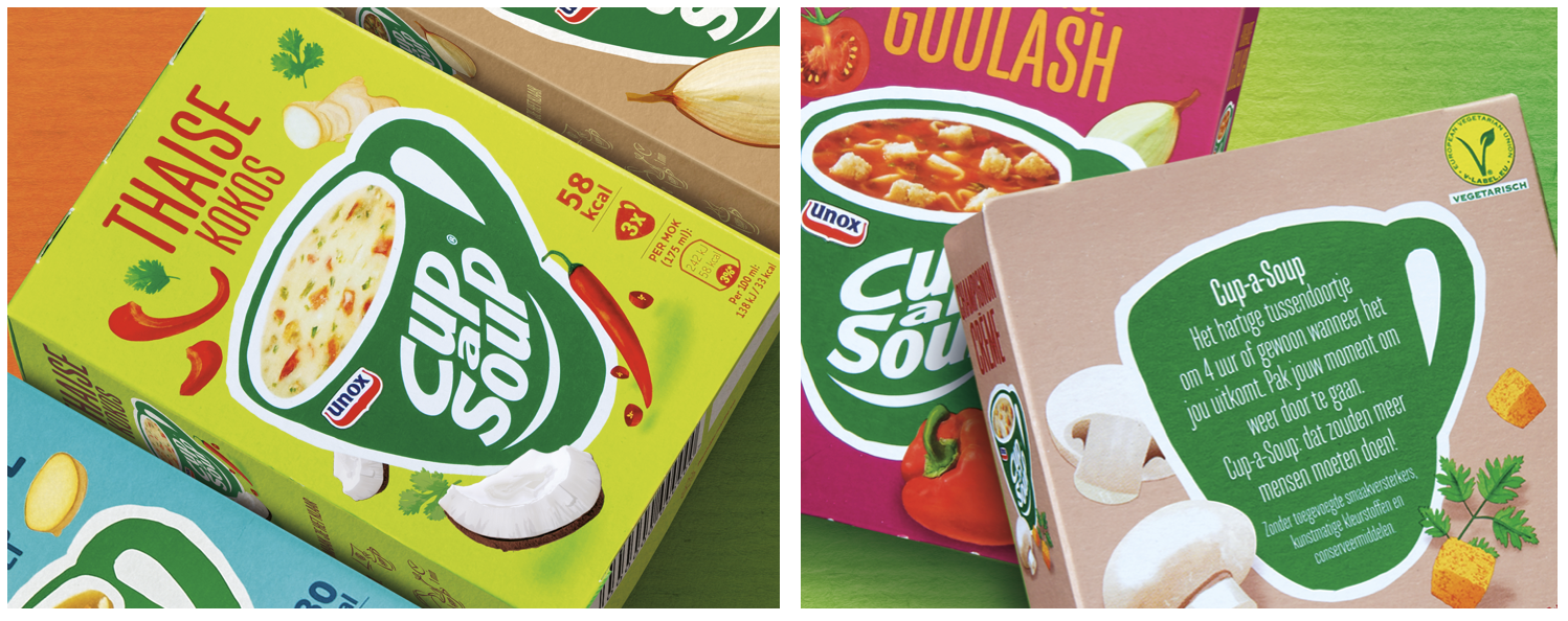
Cup-a-Soup is a brand with strong, well-established brand assets. The green mug is an icon for an easy-to-make, uplifting soup. In most countries, it’s part of a traditional meal moment and focused on a more mature age group.
In the Netherlands, however, it has always been an in-between snack, positioned especially around the end of the afternoon, when hunger kicks in and the next meal still feels far away. It’s the leading brand in its category and a household name.
The international packaging design felt too much like a meal component. Dutch consumers viewed it as a regressive, traditional soup product, and the brand lost its role as a progressive pick-me-up.
Marcel & his team at Anthem/SGK redesigned the packaging portfolio, building on the strong assets but with a snack-like visual style and colour range. Making use of the strong brand heritage while shifting the perception back to in-between moment, which resulted in increased sales.
Calvé, il ketchup più bello
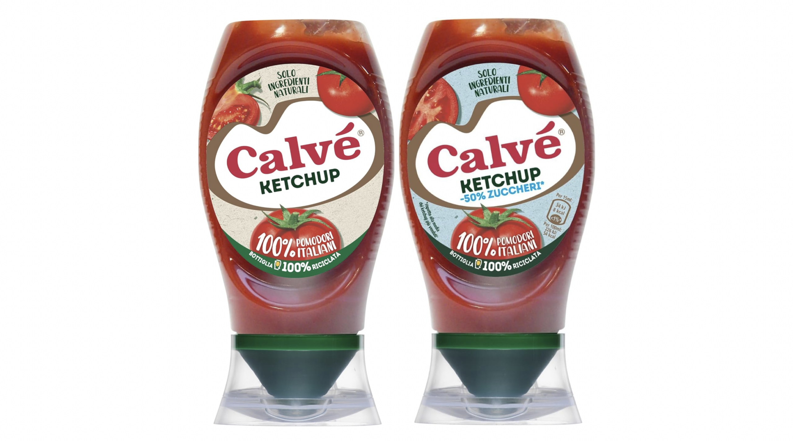
Ketchup is big in Italy and Calvé is the iconic ketchup brand. A brand with an extensive range of sauces.
For Italians, there is nothing international or Dutch about Calvé; it’s quintessentially Italian.
The international design didn’t fit the positioning and market dominance.
The aim of the redesign was to establish more shelf impact by simplifying the packaging architecture. Linking provenance more to the brand, bringing more energy to the brand device and creating a better portfolio built up. Improved and more natural product visuals and structure for messaging.
With increased shelf impact and a better connection to food trends, the new design established Calvé as the undisputed #1 in the Italian market.
Knorr, un peu plus ondulée
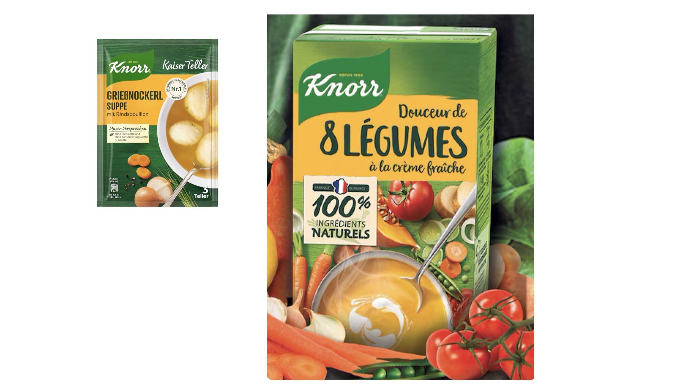
Knorr is one of the world’s largest consumer packaged goods brands and is sold in over 90 countries. Despite being a global brand, Knorr understands that food is also local.
The packaging design uses the same design grid and style in almost every country. In theory, this is a good strategy for building strong brand recognition and achieving economies of scale.
But sometimes a brand needs to adapt to retain and build its consumer base, because food cultures differ and the brand is too important locally to take risks.
France was one of those exceptions. French consumers rejected the international design concept as too industrial and lacking credibility as a tasty choice, especially because of the food photography and ingredients.
While still using brand assets and core elements of the international design, the new packaging was more tailored to address the French taste and quality appeal, helping Knorr maintain its leading position in the market.
more work
Unilever has been a client of Marcel and Nike for more than 10 years. Many lessons learned on distinctiveness and how to grow brand by evolutionary design. Not just on the above brands but also on Conimex and Unox. Building on strong brand assets and adapting the packaging design towards new visual styles of photography and graphics to connect better with new generations.
If you want to know more about keeping food packaging in touch with today & tomorrow, drop us a line.

- Privacy
- Cookies
- Cookie settings
- © 2026 Perspective Brussels BV